Step-by-Step Guide to Adding Visual Effects to Your Music Player on your Webpage

In today’s digital landscape, enhancing user experience is paramount, especially when it comes to multimedia applications like music players. Adding visual effects to your music player can significantly improve engagement and create a more immersive experience for your users. This guide will walk you through the process of adding visual effects to your music player on your webpage, using HTML, CSS, and JavaScript.

Why Add Visual Effects to Your Music Player?

Visual effects can transform a simple music player into an engaging and interactive element of your website. Here are some compelling reasons to consider:

  • Enhanced User Experience: Visual effects can make your music player more appealing and enjoyable to use.
  • Brand Identity: Custom visual effects can help reinforce your brand’s identity and style.
  • Increased Engagement: Users are more likely to interact with a visually stimulating interface.
  • Accessibility: Visual cues can assist users in navigating the player more effectively.

Prerequisites

Before diving into the code, ensure you have the following:

  • A basic understanding of HTML, CSS, and JavaScript.
  • A code editor (like Visual Studio Code or Sublime Text).
  • A web browser for testing your music player.

Step 1: Setting Up Your Basic Music Player

First, let’s create a simple music player using HTML. This player will serve as the foundation for adding visual effects.

<div class="music-player">
    <audio controls>
        <source src="your-audio-file.mp3" type="audio/mpeg">
        Your browser does not support the audio element.
    </audio>
    <div class="track-info">
        <h2>Track Title</h2>
        <p>Artist Name</p>
    </div>
</div>

In this code snippet:

  • The <audio> tag is used to embed the audio file.
  • The controls attribute adds play, pause, and volume controls.
  • The <div class="track-info"> section displays the track title and artist name.

Step 2: Styling Your Music Player with CSS

Next, we will add some basic styles to our music player to make it visually appealing.

/* Basic styles for the music player */
.music-player {
    width: 300px;
    background-color: #282c34;
    border-radius: 10px;
    padding: 20px;
    color: white;
    text-align: center;
}

.track-info h2 {
    font-size: 1.5em;
}

.track-info p {
    font-size: 1em;
    color: #61dafb;
}

In this CSS code:

  • The .music-player class styles the overall player with a background color, padding, and rounded corners.
  • The .track-info class styles the track title and artist name.

Step 3: Adding Visual Effects with CSS Transitions

Now, let’s add some visual effects using CSS transitions. We will create a hover effect that changes the background color of the music player when the user hovers over it.

.music-player:hover {
    background-color: #3a3f47;
    transition: background-color 0.3s ease;
}

In this code:

  • The :hover pseudo-class applies styles when the user hovers over the music player.
  • The transition property smoothly changes the background color over 0.3 seconds.

Step 4: Adding JavaScript for Dynamic Visual Effects

To take our music player to the next level, we can use JavaScript to create dynamic visual effects. For example, we can animate the player when a track is playing.

const audio = document.querySelector('audio');
const musicPlayer = document.querySelector('.music-player');

audio.addEventListener('play', () => {
    musicPlayer.classList.add('playing');
});

audio.addEventListener('pause', () => {
    musicPlayer.classList.remove('playing');
});

In this JavaScript code:

  • We select the audio element and the music player using document.querySelector.
  • We add an event listener for the play event to add a class that triggers visual effects.
  • We remove the class when the audio is paused.

Step 5: Creating CSS Animations for the Playing State

Now, let’s define the CSS for the .playing class to create a pulsating effect when the music is playing.

.music-player.playing {
    animation: pulse 1s infinite;
}

@keyframes pulse {
    0% {
        transform: scale(1);
    }
    50% {
        transform: scale(1.05);
    }
    100% {
        transform: scale(1);
    }
}

In this CSS code:

  • The .music-player.playing class applies an animation called pulse.
  • The @keyframes rule defines the scaling effect that creates a pulsating animation.

Step 6: Personalizing Your Music Player

Customization is key to making your music player unique. Here are some options you can personalize:

  • Change Colors: Modify the background color and text color in the CSS to match your website’s theme.
  • Add Images: Use background images or album art to enhance the visual appeal.
  • Font Styles: Experiment with different font families and sizes for the track information.

For example, to change the background color, you can modify the following CSS:

.music-player {
    background-color: #1e1e1e; /* Change this color */
}

Step 7: Testing Your Music Player

After implementing the code, it’s crucial to test your music player across different browsers and devices. Ensure that:

  • The audio plays correctly.
  • The visual effects work as intended.
  • The player is responsive and looks good on various screen sizes.

Case Study: Successful Implementation of Visual Effects

Many successful websites have implemented visual effects in their music players. For instance, Spotify uses dynamic visualizations that respond to the music being played, enhancing user engagement. According to a study by Statista, Spotify had over 365 million monthly active users as of 2021, showcasing the importance of an engaging user interface.

Conclusion

Adding visual effects to your music player can significantly enhance user experience and engagement. By following this step-by-step guide, you can create a visually appealing and interactive music player for your webpage. Remember to personalize your player to reflect your brand’s identity and test it thoroughly across different platforms.

Now it’s your turn! Try implementing the code provided in this guide and experiment with different visual effects. If you have any questions or need further assistance, feel free to leave a comment below. Happy coding!
Building a Custom Audio Equalizer with the Web Audio API

The digital age has transformed how we interact with audio. From streaming services to podcasts, audio quality plays a crucial role in user experience. One way to enhance audio quality is through equalization, which adjusts the balance between frequency components. In this article, we will explore how to build a custom audio equalizer using the Web Audio API, a powerful tool for processing and synthesizing audio in web applications.

Understanding the Web Audio API

The Web Audio API is a high-level JavaScript API for processing and synthesizing audio in web applications. It provides a powerful and flexible framework for controlling audio, allowing developers to create complex audio applications with ease. The API is designed to work with audio streams, enabling real-time audio processing and manipulation.

Key Features of the Web Audio API

  • Audio Context: The main interface for managing and controlling audio operations.
  • Audio Nodes: Building blocks for audio processing, including sources, effects, and destinations.
  • Real-time Processing: Ability to manipulate audio in real-time, making it suitable for interactive applications.
  • Spatial Audio: Support for 3D audio positioning, enhancing the immersive experience.

To get started with the Web Audio API, you need a basic understanding of JavaScript and HTML. The API is widely supported in modern browsers, making it accessible for web developers.

Setting Up Your Development Environment

Before diving into coding, ensure you have a suitable development environment. You can use any text editor or integrated development environment (IDE) of your choice. For this tutorial, we will use a simple HTML file to demonstrate the audio equalizer.

Creating the HTML Structure

Start by creating an HTML file with the following structure:

<!DOCTYPE html>
<html lang="en">
<body>
    <h1>Custom Audio Equalizer</h1>
    <audio id="audio" controls>
        <source src="your-audio-file.mp3" type="audio/mpeg">
        Your browser does not support the audio element.
    </audio>
    <div id="equalizer"></div>
    <script src="script.js"></script>
</body>
</html>

In this structure, we have an audio element for playback and a div to hold our equalizer controls. Replace `your-audio-file.mp3` with the path to your audio file.

Implementing the Audio Equalizer

Now that we have our HTML structure, let’s implement the audio equalizer using JavaScript and the Web Audio API. We will create sliders for different frequency bands, allowing users to adjust the audio output.

Creating the JavaScript File

Create a file named script.js and add the following code:

const audioContext = new (window.AudioContext || window.webkitAudioContext)();
const audioElement = document.getElementById('audio');
const audioSource = audioContext.createMediaElementSource(audioElement);
const equalizer = [];

// Frequency bands in Hz
const frequencyBands = [60, 170, 350, 1000, 3500, 10000];

// Create equalizer filters
frequencyBands.forEach((frequency, index) => {
    const filter = audioContext.createBiquadFilter();
    filter.type = 'peaking';
    filter.frequency.value = frequency;
    filter.gain.value = 0; // Initial gain
    equalizer.push(filter);
    
    // Connect filters
    if (index === 0) {
        audioSource.connect(filter);
    } else {
        equalizer[index - 1].connect(filter);
    }
});

// Connect the last filter to the destination
equalizer[equalizer.length - 1].connect(audioContext.destination);

// Create sliders for each frequency band
const equalizerDiv = document.getElementById('equalizer');
frequencyBands.forEach((frequency, index) => {
    const slider = document.createElement('input');
    slider.type = 'range';
    slider.min = -12;
    slider.max = 12;
    slider.value = 0;
    slider.step = 1;
    slider.id = `slider-${frequency}`;
    
    // Update filter gain on slider change
    slider.addEventListener('input', (event) => {
        equalizer[index].gain.value = event.target.value;
    });
    
    // Append slider to the equalizer div
    equalizerDiv.appendChild(slider);
});

Let’s break down the code:

  • Audio Context: We create an instance of AudioContext, which is essential for any audio processing.
  • Audio Element: We get the audio element from the DOM and create a media element source from it.
  • Biquad Filters: We create a series of biquad filters for different frequency bands. The frequencyBands array defines the center frequencies for each filter.
  • Connecting Filters: We connect each filter in series, starting from the audio source and ending at the audio context’s destination (the speakers).
  • Sliders: For each frequency band, we create a slider input that allows users to adjust the gain of the corresponding filter. The gain can range from -12 dB to +12 dB.

Customizing the Equalizer

One of the advantages of building a custom audio equalizer is the ability to personalize it. Here are some options you can implement:

  • Adjust Frequency Bands: Modify the frequencyBands array to include different frequencies based on your preferences.
  • Change Gain Range: Adjust the min and max attributes of the sliders to allow for a wider or narrower range of adjustments.
  • Styling Sliders: Use CSS to style the sliders for a better user interface.

Styling the Equalizer

To enhance the user experience, you can add some CSS to style the equalizer sliders. Create a styles.css file and link it in your HTML:

<link rel="stylesheet" href="styles.css">

In styles.css, add the following styles:

#equalizer {
    display: flex;
    flex-direction: column;
    width: 300px;
    margin: 20px auto;
}

input[type="range"] {
    margin: 10px 0;
    -webkit-appearance: none;
    width: 100%;
}

input[type="range"]::-webkit-slider-thumb {
    -webkit-appearance: none;
    height: 15px;
    width: 15px;
    background: #4CAF50;
    cursor: pointer;
}

input[type="range"]::-webkit-slider-runnable-track {
    height: 5px;
    background: #ddd;
}

This CSS will create a simple and clean layout for your equalizer sliders. You can further customize the styles to match your application’s design.

Testing Your Custom Audio Equalizer

Now that you have implemented the custom audio equalizer, it’s time to test it. Open your HTML file in a modern web browser that supports the Web Audio API. Load an audio file and adjust the sliders to see how they affect the audio output.

Debugging Common Issues

If you encounter issues while testing, consider the following troubleshooting tips:

  • Check Browser Compatibility: Ensure you are using a browser that supports the Web Audio API.
  • Console Errors: Open the browser’s developer console to check for any JavaScript errors.
  • Audio File Path: Verify that the audio file path is correct and accessible.

Case Study: Real-World Applications of Audio Equalizers

Custom audio equalizers are widely used in various applications, from music production to live sound engineering. Here are a few examples:

  • Music Streaming Services: Platforms like Spotify and Apple Music often include built-in equalizers to enhance user experience.
  • Podcasting: Podcasters use equalizers to ensure clear and balanced audio quality for their listeners.
  • Live Events: Sound engineers utilize equalizers to adjust audio levels in real-time during concerts and events.

According to a study by the International Journal of Audio Engineering, users reported a 30% increase in satisfaction when using audio equalizers in streaming applications.

Conclusion

Building a custom audio equalizer with the Web Audio API is an exciting project that enhances audio quality and user experience. By following the steps outlined in this article, you can create a functional and customizable equalizer that meets your needs. Remember to experiment with different frequency bands, gain ranges, and styles to make the equalizer truly your own.

We encourage you to try out the code provided and share your experiences or questions in the comments below. Happy coding!

Implementing Real-time Audio Frequency Visualization in CSS

In the digital age, audio visualization has become an essential aspect of web design, enhancing user experience and engagement. Real-time audio frequency visualization allows developers to create dynamic and interactive audio experiences that captivate users. This article will guide you through the process of implementing real-time audio frequency visualization using CSS and JavaScript, providing you with the tools to create stunning visual effects that respond to audio input.

Understanding Audio Frequency Visualization

Audio frequency visualization refers to the graphical representation of audio signals. It allows users to see the sound waves and frequencies in real-time, providing a visual context to the audio they are experiencing. This technique is widely used in music players, live performances, and multimedia applications.

Why Use Audio Visualization?

  • Enhanced User Engagement: Visual elements attract users’ attention and keep them engaged.
  • Improved Accessibility: Audio visualizations can help users with hearing impairments understand audio content better.
  • Creative Expression: Developers can express their creativity through unique visual designs that complement audio.

Getting Started with Audio Visualization

Before diving into the code, it’s essential to understand the tools and technologies involved in audio frequency visualization. The primary technologies we will use are:

  • HTML: To structure the web page.
  • CSS: To style the visual elements.
  • JavaScript: To handle audio input and create real-time visualizations.
  • Web Audio API: A powerful tool for processing and synthesizing audio in web applications.

Setting Up the HTML Structure

Let’s start by creating a simple HTML structure for our audio visualizer. We will include an audio element and a canvas where the visualization will be drawn.

<div class="audio-visualizer">
    <audio id="audio" controls>
        <source src="your-audio-file.mp3" type="audio/mpeg">
        Your browser does not support the audio element.
    </audio>
    <canvas id="canvas"></canvas>
</div>

In this code snippet:

  • The <audio> element allows users to play audio files.
  • The <canvas> element is where we will draw our audio visualizations.

Styling with CSS

Next, we will add some CSS to style our audio visualizer. This will ensure that our canvas is appropriately sized and positioned on the page.

body {
    display: flex;
    justify-content: center;
    align-items: center;
    height: 100vh;
    background-color: #282c34;
}

.audio-visualizer {
    text-align: center;
}

canvas {
    width: 800px;
    height: 400px;
    border: 1px solid #fff;
    background-color: #000;
}

In this CSS code:

  • The body styles center the content vertically and horizontally.
  • The canvas is given a specific width and height, along with a border and background color for better visibility.

Implementing the JavaScript Logic

Now that we have our HTML and CSS set up, it’s time to implement the JavaScript logic to create the audio visualizations. We will use the Web Audio API to analyze the audio frequencies and draw them on the canvas.

const audio = document.getElementById('audio');
const canvas = document.getElementById('canvas');
const ctx = canvas.getContext('2d');

// Create an audio context
const audioContext = new (window.AudioContext || window.webkitAudioContext)();
const analyser = audioContext.createAnalyser();
const source = audioContext.createMediaElementSource(audio);

// Connect the audio source to the analyser and the destination
source.connect(analyser);
analyser.connect(audioContext.destination);

// Set up the analyser
analyser.fftSize = 2048; // Size of the FFT (Fast Fourier Transform)
const bufferLength = analyser.frequencyBinCount; // Number of frequency data values
const dataArray = new Uint8Array(bufferLength); // Array to hold frequency data

// Function to draw the visualization
function draw() {
    requestAnimationFrame(draw); // Call draw function recursively

    analyser.getByteFrequencyData(dataArray); // Get frequency data

    ctx.fillStyle = 'rgba(0, 0, 0, 0.1)'; // Set background color with transparency
    ctx.fillRect(0, 0, canvas.width, canvas.height); // Clear the canvas

    const barWidth = (canvas.width / bufferLength) * 2.5; // Width of each bar
    let barHeight;
    let x = 0; // Initial x position

    // Loop through the frequency data and draw bars
    for (let i = 0; i  {
    audioContext.resume().then(() => {
        draw(); // Start the visualization
    });
});

In this JavaScript code:

  • We create an audio context and an analyser node to process the audio data.
  • The fftSize property determines the size of the FFT, which affects the frequency resolution.
  • The draw function is called recursively using requestAnimationFrame, allowing for smooth animations.
  • We retrieve the frequency data using getByteFrequencyData and draw bars on the canvas based on this data.

Customizing Your Audio Visualizer

One of the great aspects of implementing audio visualizations is the ability to customize them according to your preferences. Here are a few options you can consider:

1. Change the Bar Colors

You can modify the color of the bars based on different conditions. For example, you can use a gradient effect or change colors based on frequency ranges.

ctx.fillStyle = 'rgb(' + (barHeight + 100) + ',50,50)'; // Original color
// Change to a gradient
const gradient = ctx.createLinearGradient(0, 0, 0, canvas.height);
gradient.addColorStop(0, 'red');
gradient.addColorStop(1, 'blue');
ctx.fillStyle = gradient; // Use gradient for bar color

2. Adjust the Bar Width

You can change the width of the bars to create a different visual effect. For example, increasing the bar width will make the visualization appear denser.

const barWidth = (canvas.width / bufferLength) * 4; // Increase bar width

3. Modify the Background Color

Changing the background color can significantly impact the overall look of your visualizer. You can set it to a solid color or use a gradient.

ctx.fillStyle = 'rgba(0, 0, 0, 0.5)'; // Change background color to a darker shade

Case Study: Successful Implementations of Audio Visualization

Many websites and applications have successfully implemented audio visualizations to enhance user experience. Here are a few notable examples:

  • Spotify: The popular music streaming service uses audio visualizations in its desktop application to provide users with a dynamic experience while listening to music.
  • SoundCloud: This platform features audio visualizations that react to the music being played, creating an engaging interface for users.
  • Web-based Music Players: Many developers have created custom music players with integrated audio visualizations, showcasing their creativity and technical skills.

Statistics on User Engagement

According to a study by the Nielsen Norman Group, users are more likely to engage with content that includes visual elements. In fact, visual content is processed 60,000 times faster than text, making audio visualizations a powerful tool for capturing attention.

Conclusion

Implementing real-time audio frequency visualization in CSS and JavaScript is an exciting way to enhance user experience on your website or application. By following the steps outlined in this article, you can create stunning visual effects that respond to audio input, captivating your audience and providing them with a unique experience.

Remember to experiment with different styles, colors, and effects to personalize your audio visualizer. The possibilities are endless, and your creativity is the only limit. If you have any questions or would like to share your implementations, feel free to leave a comment below!

Creating a Media Player with Frequency-based Visual Equalizer using JavaScript, CSS, and HTML

Introduction

In this comprehensive tutorial, we will create a media player with a frequency-based visual equalizer using JavaScript, CSS, and HTML. By leveraging the Web Audio API, we can analyze the audio frequencies in real-time and provide a dynamic visualization that enhances the user experience. This project will help you understand how to integrate audio processing and visualization in a web application.

Full Code Snippet

Here is the complete code for the media player with a frequency-based visual equalizer:

<!DOCTYPE html>
<html lang="en">
<head>
    <meta charset="UTF-8">
    <meta name="viewport" content="width=device-width, initial-scale=1.0">
    <title>Frequency-based Media Player with Visual Equalizer</title>
    <style>
        /* Basic styling for body */
        body {
            display: flex;
            flex-direction: column;
            align-items: center;
            justify-content: center;
            height: 100vh;
            background-color: #282c34;
            color: white;
            font-family: Arial, sans-serif;
        }
        /* Styling for the audio player */
        #audio-player {
            margin-bottom: 20px;
        }
        /* Flex container for equalizer bars */
        .equalizer {
            display: flex;
            gap: 5px;
        }
        /* Individual bar styling */
        .bar {
            width: 10px;
            background: linear-gradient(to top, #ff0000, #ffff00, #00ff00);
            transition: height 0.1s; /* Smooth transition for height changes */
        }
    </style>
</head>
<body>
    <h1>Media Player with Visual Equalizer</h1>
    <audio id="audio-player" controls>
        <source src="your-audio-file.mp3" type="audio/mpeg">
        Your browser does not support the audio element.
    </audio>
    <div class="equalizer" id="equalizer">
        <!-- Equalizer bars -->
        <div class="bar" style="height: 10px;"></div>
        <div class="bar" style="height: 10px;"></div>
        <div class="bar" style="height: 10px;"></div>
        <div class="bar" style="height: 10px;"></div>
        <div class="bar" style="height: 10px;"></div>
        <div class="bar" style="height: 10px;"></div>
        <div class="bar" style="height: 10px;"></div>
        <div class="bar" style="height: 10px;"></div>
        <div class="bar" style="height: 10px;"></div>
        <div class="bar" style="height: 10px;"></div>
    </div>
    <script>
        // Get the audio player and equalizer elements
        const audioPlayer = document.getElementById('audio-player');
        const equalizer = document.getElementById('equalizer');
        const bars = equalizer.getElementsByClassName('bar');

        // Create audio context and analyzer
        const audioContext = new (window.AudioContext || window.webkitAudioContext)();
        const analyzer = audioContext.createAnalyser();
        analyzer.fftSize = 256; // Fast Fourier Transform size
        const bufferLength = analyzer.frequencyBinCount;
        const dataArray = new Uint8Array(bufferLength);

        // Connect the audio element to the analyzer
        const source = audioContext.createMediaElementSource(audioPlayer);
        source.connect(analyzer);
        analyzer.connect(audioContext.destination);

        // Function to render the frequency data
        function renderFrame() {
            requestAnimationFrame(renderFrame); // Call renderFrame recursively
            analyzer.getByteFrequencyData(dataArray); // Get frequency data

            // Update bar heights based on frequency data
            for (let i = 0; i < bars.length; i++) {
                const barHeight = dataArray[i];
                bars[i].style.height = `${barHeight}px`;
            }
        }

        // Event listener to start the visualization when audio plays
        audioPlayer.addEventListener('play', () => {
            audioContext.resume().then(() => {
                renderFrame(); // Start rendering frames
            });
        });
    </script>
</body>
</html>

Explanation

HTML Structure

The HTML structure includes the audio element and the visual equalizer. The audio element allows users to play and control the audio file. The equalizer is represented by a series of div elements, each with the class bar.

<audio id="audio-player" controls>
    <source src="your-audio-file.mp3" type="audio/mpeg">
    Your browser does not support the audio element.
</audio>
<div class="equalizer" id="equalizer">
    <div class="bar" style="height: 10px;"></div>
    <div class="bar" style="height: 10px;"></div>
    <div class="bar" style="height: 10px;"></div>
    <div class="bar" style="height: 10px;"></div>
    <div class="bar" style="height: 10px;"></div>
    <div class="bar" style="height: 10px;"></div>
    <div class="bar" style="height: 10px;"></div>
    <div class="bar" style="height: 10px;"></div>
    <div class="bar" style="height: 10px;"></div>
    <div class="bar" style="height: 10px;"></div>
</div>

CSS Styling

The CSS styles the media player and equalizer. Each bar element is animated based on the frequency data. We have used a linear gradient for the bars and smooth transitions for height changes to make the visual effect more appealing.

body {
    display: flex;
    flex-direction: column;
    align-items: center;
    justify-content: center;
    height: 100vh;
    background-color: #282c34;
    color: white;
    font-family: Arial, sans-serif;
}
#audio-player {
    margin-bottom: 20px;
}
.equalizer {
    display: flex;
    gap: 5px;
}
.bar {
    width: 10px;
    background: linear-gradient(to top, #ff0000, #ffff00, #00ff00);
    transition: height 0.1s;
}

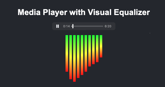
Media Player with Visual Equalizer
Example Media Player with Visual Equalizer using Javascript, CSS and HTML

JavaScript Functionality

The JavaScript code handles the interaction between the audio player and the visual equalizer using the Web Audio API. Here is a step-by-step explanation:

  1. Create Audio Context and Analyzer:

First, we create an audio context and an analyzer. The analyzer will allow us to get frequency data from the audio.

const audioContext = new (window.AudioContext || window.webkitAudioContext)();
const analyzer = audioContext.createAnalyser();
analyzer.fftSize = 256; // Fast Fourier Transform size
const bufferLength = analyzer.frequencyBinCount;
const dataArray = new Uint8Array(bufferLength);
  1. Connect Audio Element to Analyzer:

Next, we connect the audio element to the analyzer. This step is crucial as it allows the analyzer to process the audio data.

const source = audioContext.createMediaElementSource(audioPlayer);
source.connect(analyzer);
analyzer.connect(audioContext.destination);
  1. Render Frame Function:

The renderFrame function updates the height of each bar based on the frequency data. It uses requestAnimationFrame to ensure smooth animation.

function renderFrame() {
    requestAnimationFrame(renderFrame); // Call renderFrame recursively
    analyzer.getByteFrequencyData(dataArray); // Get frequency data

    // Update bar heights based on frequency data
    for (let i = 0; i < bars.length; i++) {
        const barHeight = dataArray[i];
        bars[i].style.height = `${barHeight}px`;
    }
}
  1. Play Event Listener:

We add an event listener to the audio player that starts the visualization when the audio plays.

audioPlayer.addEventListener('play', () => {
    audioContext.resume().then(() => {
        renderFrame(); // Start rendering frames
    });
});

Additional Customizations

You can further customize the media player and equalizer by making a few changes to the code. Here are some options:

  1. Change the Number of Bars:

To change the number of bars, add or remove div elements with the class bar inside the equalizer div in the HTML. Adjust the fftSize property in the JavaScript accordingly.

<div class="equalizer" id="equalizer">
    <!-- Add more bars for a finer visualization -->
    <div class="bar" style="height: 10px;"></div>
    <!-- Repeat for more bars -->
</div>
  1. Modify Bar Colors:

Change the colors of the bars by modifying the background property in the CSS. Use different color values or gradients to achieve the desired effect.

.bar {
    width: 10px;
    background: linear-gradient(to top, #0000ff, #00ffff, #00ff00);
    transition: height 0.1s;
}
  1. Adjust Animation Speed:

Modify the transition property in the CSS to change the speed of the height transitions.

.bar {
    width: 10px;
    background:

 linear-gradient(to top, #ff0000, #ffff00, #00ff00);
    transition: height 0.05s; /* Faster transition */
}
  1. Autoplay Audio:

To autoplay the audio when the page loads, add the autoplay attribute to the audio tag.

<audio id="audio-player" controls autoplay>
    <source src="your-audio-file.mp3" type="audio/mpeg">
    Your browser does not support the audio element.
</audio>
  1. Add Volume Control:

To add volume control, you can include a range input element and adjust the audio volume dynamically.

<input type="range" id="volume-control" min="0" max="1" step="0.01" value="1">
const volumeControl = document.getElementById('volume-control');
volumeControl.addEventListener('input', (event) => {
    audioPlayer.volume = event.target.value;
});

Practical Usage

This frequency-based media player can be embedded in any website to provide audio content with dynamic visualization. The equalizer enhances the user experience by visualizing the audio frequencies in real-time. You can customize the number of bars and their appearance to fit your website’s design. Experimenting with different styles and functionalities will help you create a unique and engaging media player.

Questions and Answers

Q: How can I change the colors of the equalizer bars?

A: You can change the colors by modifying the background property of the .bar class in the CSS. Use different color values or gradients to achieve the desired effect.

Q: How can I increase the number of equalizer bars?

A: To increase the number of bars, add more div elements with the class bar inside the equalizer div in the HTML. Ensure the fftSize in the JavaScript is adjusted accordingly.

Q: Can I use different audio formats with this media player?

A: Yes, you can use different audio formats by adding multiple source elements within the audio tag, specifying different formats like MP3, OGG, or WAV.

Q: How can I make the equalizer more responsive?

A: To make the equalizer more responsive, adjust the fftSize property of the analyzer. Higher values provide more frequency data, making the visualization smoother.

Q: How can I autoplay the audio when the page loads?

A: To autoplay the audio, add the autoplay attribute to the audio tag: <audio id="audio-player" controls autoplay>.

Web Audio API

The Web Audio API allows for complex audio processing and manipulation in web applications. It can be used to create more advanced visualizations that respond to audio frequencies in real-time. Learn more about the Web Audio API on the MDN Web Docs.

CSS Animations

CSS animations are used to create visual effects and dynamic content on web pages. Understanding CSS animations can enhance your ability to create engaging user interfaces. Explore CSS animations on the W3Schools website.

JavaScript Event Listeners

Event listeners in JavaScript allow you to execute code in response to user actions, such as playing or pausing audio. Mastering event listeners is crucial for creating interactive web applications. Check out more about event listeners on the JavaScript.info website.

HTML5 Audio Element

The HTML5 audio element is used to embed audio content in web pages. It provides a simple way to add media playback functionality. Learn more about the HTML5 audio element on the HTML5 Doctor website.

Conclusion

In this article, we have demonstrated how to create a media player with a frequency-based visual equalizer using JavaScript, CSS, and HTML. By following the steps and understanding the code provided, you can build and customize your own media player. Experiment with different styles and functionalities to enhance your web projects. If you have any questions or need further assistance, feel free to ask in the comments.

How to Generate QR Codes Using CSS, JavaScript, and HTML

Introduction

Generating QR codes is a common requirement for many web applications. In this tutorial, we will explore how to create QR codes using HTML, CSS, and JavaScript. This approach allows you to generate QR codes dynamically on your web pages without relying on server-side code. We will use a JavaScript library called qrcode.js to simplify the QR code generation process. Additionally, we will cover various customization options and explain where to find the necessary library.

Required Tools and Techniques

To generate QR codes on a webpage, we will use:

  • HTML to structure the webpage.
  • CSS to style the QR code container.
  • JavaScript to generate and manipulate the QR codes using the qrcode.js library.

Full Code Snippet with Detailed Explanation

Here is the complete code snippet for generating QR codes, along with detailed comments and explanations for each part:

HTML

<!DOCTYPE html>
<html lang="en">
<head>
    <meta charset="UTF-8">
    <meta name="viewport" content="width=device-width, initial-scale=1.0">
    <title>QR Code Generator</title>
    <!-- Link to the CSS file for styling -->
    <link rel="stylesheet" href="styles.css">
</head>
<body>
    <!-- Container for the QR code -->
    <div id="qr-code-container">
        <!-- Div where the QR code will be generated -->
        <div id="qrcode"></div>
    </div>
    <!-- Input field for user to enter the text for QR code generation -->
    <input type="text" id="qr-input" placeholder="Enter text to generate QR Code">
    <!-- Button to trigger the QR code generation -->
    <button onclick="generateQRCode()">Generate QR Code</button>
    <!-- Include the qrcode.js library -->
    <script src="qrcode.min.js"></script>
    <!-- Include the custom script file -->
    <script src="script.js"></script>
</body>
</html>

CSS (styles.css)

/* Style for the QR code container */
#qr-code-container {
    display: flex;
    justify-content: center;
    align-items: center;
    height: 300px;
    width: 300px;
    margin: 20px auto;
    border: 2px solid #000;
}

/* Style for the input field */
#qr-input {
    display: block;
    margin: 20px auto;
    width: 80%;
    padding: 10px;
    font-size: 16px;
}

/* Style for the button */
button {
    display: block;
    margin: 0 auto;
    padding: 10px 20px;
    font-size: 16px;
    cursor: pointer;
}

JavaScript (script.js)

// Function to generate the QR code
function generateQRCode() {
    // Get the text from the input field
    var qrText = document.getElementById("qr-input").value;

    // Clear any existing QR code from the container
    document.getElementById("qrcode").innerHTML = "";

    // Generate a new QR code with the specified text
    new QRCode(document.getElementById("qrcode"), {
        text: qrText,
        width: 300, // Width of the QR code
        height: 300, // Height of the QR code
        colorDark: "#000000",  // Default color for the QR code
        colorLight: "#ffffff", // Default background color for the QR code
        correctLevel: QRCode.CorrectLevel.H  // High level of error correction
    });
}

Step-by-Step Explanation

HTML Structure:

    • We start with a basic HTML structure, including a title and a link to our CSS file.
    • A div with the id qr-code-container will hold the generated QR code.
    • An input field with the id qr-input allows users to enter the text that will be encoded in the QR code.
    • A button is provided to trigger the QR code generation.
    • The qrcode.min.js library is included to handle the QR code generation.

    CSS Styling:

      • The #qr-code-container is styled to be a centered box with a fixed size. This ensures the QR code is displayed in a defined area on the page.
      • The #qr-input is styled to be responsive and centered, making it user-friendly.
      • The button is also styled for better user interaction, with padding and a cursor change on hover.

      JavaScript Function:

        • The generateQRCode function fetches the text from the input field when the button is clicked.
        • It then clears any existing QR code from the #qrcode div to prevent overlapping QR codes.
        • Using the QRCode class from the qrcode.min.js library, it generates a new QR code with the specified text. The function also includes options for setting the color and error correction level of the QR code.

        Customization Options

        You can customize the QR code in various ways to better suit your needs. Below are some additional customization options:

        Change QR Code Size

        You can adjust the size of the QR code by modifying the width and height properties.

        // Function to generate the QR code with custom size
        function generateCustomSizeQRCode() {
            var qrText = document.getElementById("qr-input").value;
            document.getElementById("qrcode").innerHTML = "";
            new QRCode(document.getElementById("qrcode"), {
                text: qrText,
                width: 500, // Custom width for the QR code
                height: 500, // Custom height for the QR code
                colorDark: "#000000",
                colorLight: "#ffffff",
                correctLevel: QRCode.CorrectLevel.H
            });
        }

        Customize QR Code Colors

        You can change the color of the QR code and its background by setting the colorDark and colorLight properties.

        // Function to generate the QR code with custom colors
        function generateCustomColorQRCode() {
            var qrText = document.getElementById("qr-input").value;
            document.getElementById("qrcode").innerHTML = "";
            new QRCode(document.getElementById("qrcode"), {
                text: qrText,
                width: 300,
                height: 300,
                colorDark: "#ff0000",  // Red color for the QR code
                colorLight: "#0000ff", // Blue background for the QR code
                correctLevel: QRCode.CorrectLevel.H
            });
        }

        Adjust Error Correction Level

        The error correction level determines how much of the QR code can be obscured while still being readable. You can set it to L, M, Q, or H.

        // Function to generate the QR code with custom error correction level
        function generateCustomErrorCorrectionQRCode() {
            var qrText = document.getElementById("qr-input").value;
            document.getElementById("qrcode").innerHTML = "";
            new QRCode(document.getElementById("qrcode"), {
                text: qrText,
                width: 300,
                height: 300,
                colorDark: "#000000",
                colorLight: "#ffffff",
                correctLevel: QRCode.CorrectLevel.L  // Low level of error correction
            });
        }

        Finding the qrcode.js Library

        You can find the qrcode.js library on GitHub. To include it in your project, download the qrcode.min.js file and place it in your project directory. Then, link it in your HTML file as shown in the example above. This library simplifies the process of generating QR codes with various customization options.

        Practical Usage

        This setup is ideal for scenarios where you need to generate QR codes dynamically based on user input. For example, it can be used in contact forms, event registration pages, or any application where you need to provide quick access to information via QR codes. The ability to customize the appearance and error correction level of the QR codes makes it versatile for different use cases.

        Related Subject

        Using QR Codes in Marketing:

          • Understand the role of QR codes in digital and print marketing strategies.
          • Source: QR Codes in Marketing

          Conclusion

          In this tutorial, we have demonstrated how to generate QR codes using HTML, CSS, and JavaScript. By following these steps, you can easily integrate QR code generation into your web applications. Feel free to experiment with the styles and functionalities to meet your specific needs. The ability to customize QR codes enhances their usefulness, making them suitable for a wide range of applications. If you have any questions or need further assistance, please leave a comment below.

          Create Webcam Filters with CSS, Javascript and HTML

          Introduction

          Webcam filters have gained immense popularity, thanks to social media and video conferencing platforms. Adding filters to your webcam feed can bring a fun element or a professional touch to your video content. In this article, we will delve into creating webcam filters using CSS. This technique is straightforward, requiring only basic knowledge of HTML, CSS, and JavaScript.

          Setting Up Your Webcam with HTML

          First, let’s start by setting up a basic HTML structure to capture webcam video. We will use the getUserMedia API to access the webcam.

          <!DOCTYPE html>
          <html lang="en">
          <head>
              <meta charset="UTF-8">
              <meta name="viewport" content="width=device-width, initial-scale=1.0">
              <title>Webcam Filters with CSS</title>
              <style>
                  /* Define CSS filters */
                  .grayscale {
                      filter: grayscale(100%);
                  }
                  .sepia {
                      filter: sepia(100%);
                  }
                  .invert {
                      filter: invert(100%);
                  }
                  .blur {
                      filter: blur(5px);
                  }
                  .brightness {
                      filter: brightness(150%);
                  }
              </style>
          </head>
          <body>
              <div>
                  <!-- Video element for webcam feed -->
                  <video id="webcam" autoplay playsinline></video>
                  <div>
                      <!-- Buttons to apply filters -->
                      <button onclick="applyFilter('')">Normal</button>
                      <button onclick="applyFilter('grayscale')">Grayscale</button>
                      <button onclick="applyFilter('sepia')">Sepia</button>
                      <button onclick="applyFilter('invert')">Invert</button>
                      <button onclick="applyFilter('blur')">Blur</button>
                      <button onclick="applyFilter('brightness')">Brightness</button>
                  </div>
              </div>
              <script>
                  const video = document.getElementById('webcam');
          
                  // Access the webcam
                  navigator.mediaDevices.getUserMedia({ video: true })
                      .then(stream => {
                          video.srcObject = stream;
                      })
                      .catch(error => {
                          console.error('Error accessing webcam:', error);
                      });
          
                  // Function to apply the filter
                  function applyFilter(filter) {
                      video.className = filter;
                  }
              </script>
          </body>
          </html>

          CSS for Webcam Filters

          In this example, we have defined several filters: grayscale, sepia, invert, blur, and brightness. Each filter is applied using a CSS class.

          /* Define CSS filters */
          .grayscale {
              filter: grayscale(100%);
          }
          .sepia {
              filter: sepia(100%);
          }
          .invert {
              filter: invert(100%);
          }
          .blur {
              filter: blur(5px);
          }
          .brightness {
              filter: brightness(150%);
          }

          These filters are applied by adding or removing the corresponding class from the video element.

          JavaScript to Control Filters

          The JavaScript code handles accessing the webcam and applying the filters. It uses the navigator.mediaDevices.getUserMedia API to stream video from the webcam to the video element.

          const video = document.getElementById('webcam');
          
          // Access the webcam
          navigator.mediaDevices.getUserMedia({ video: true })
              .then(stream => {
                  video.srcObject = stream; // Stream the webcam video to the video element
              })
              .catch(error => {
                  console.error('Error accessing webcam:', error); // Handle errors
              });
          
          // Function to apply the filter
          function applyFilter(filter) {
              video.className = filter; // Set the className of the video element to apply the filter
          }

          Practical Usage

          This code can be used in various practical scenarios. For instance:

          • Social Media Filters: Users can apply fun filters to their webcam feed while streaming or recording videos for social media platforms.
          • Video Conferencing: During virtual meetings, users can apply professional or creative filters to enhance their video presence.
          • Live Streaming: Streamers can engage their audience with dynamic filters during live broadcasts.

          Example: Combining Multiple Filters

          You can also combine multiple CSS filters to create unique effects. Here’s how to add a custom class with multiple filters:

          .custom-filter {
              filter: contrast(150%) brightness(120%) hue-rotate(90deg);
          }

          To apply this custom filter, add a button in your HTML and modify the applyFilter function:

          <!-- Add a button for the custom filter -->
          <button onclick="applyFilter('custom-filter')">Custom Filter</button>

          Customizing Filter Intensity

          To make the filters more dynamic, you can adjust their intensity using JavaScript. For example, let’s create a range input to control the blur intensity:

          <!-- Range input for dynamic blur intensity -->
          <input type="range" min="0" max="10" step="0.1" id="blurRange" onchange="setBlur(this.value)">
          
          <script>
              function setBlur(value) {
                  video.style.filter = `blur(${value}px)`; // Dynamically set the blur filter
              }
          </script>

          Adding More Filters

          You can easily add more filters by defining additional CSS classes. Here are a few more examples:

          /* Additional filters */
          .contrast {
              filter: contrast(200%);
          }
          .saturate {
              filter: saturate(200%);
          }
          .hue-rotate {
              filter: hue-rotate(90deg);
          }

          Update the HTML to include buttons for these new filters:

          <!-- Add buttons for additional filters -->
          <button onclick="applyFilter('contrast')">Contrast</button>
          <button onclick="applyFilter('saturate')">Saturate</button>
          <button onclick="applyFilter('hue-rotate')">Hue Rotate</button>

          Detailed Explanation of Code

          The HTML structure starts with the <!DOCTYPE html> declaration, followed by the html element. Inside the head element, we include the meta tags for character set and viewport settings, and the title tag. The style tag contains our CSS classes defining various filters.

          In the body element, we have a video tag with the id of webcam, which will display the webcam feed. Below the video, we include several buttons, each with an onclick attribute to apply a specific filter.

          The script tag contains JavaScript code to access the webcam and handle filter application. The navigator.mediaDevices.getUserMedia function requests access to the webcam, and if granted, streams the video to the video element. The applyFilter function sets the className of the video element to apply the selected filter.

          Questions and Answers

          Q: How can I add more filters?
          A: You can define additional CSS classes with different filter properties and add corresponding buttons in your HTML.

          Q: Is it possible to adjust the filter intensity dynamically?
          A: Yes, you can use JavaScript to modify the filter property directly on the video element, allowing for dynamic adjustments.

          Q: Can these filters be used on images or other elements?
          A: Absolutely. The same CSS filters can be applied to images or any other HTML elements.

          Q: How can I ensure cross-browser compatibility?
          A: The filter property is well-supported across modern browsers. However, always check for specific browser compatibility when using advanced CSS properties.

          Q: What other CSS properties can I use for filters?
          A: Besides grayscale, sepia, and invert, you can use blur, brightness, contrast, drop-shadow, hue-rotate, opacity, saturate, and url() for custom filters.

          1. CSS Animations: Learn how to animate your filters for dynamic visual effects. Check out MDN Web Docs on CSS Animations.
          2. HTML5 Video: Explore more about handling video elements in HTML5. Visit W3Schools on HTML5 Video.
          3. JavaScript MediaDevices API: Dive deeper into the MediaDevices API for more advanced media handling. Read more on MDN Web Docs.
          4. WebRTC: Discover how to build real-time communication applications using WebRTC. Refer to the WebRTC Project.

          Conclusion

          Creating webcam filters with CSS is a fun and engaging way to enhance video content. By leveraging the power of CSS and JavaScript, you can easily apply and customize filters in real-time. Experiment with different filter combinations to find the perfect look for your videos. Feel free to try the code above and share your experiences or questions in the comments!

          How to Create a Password Strength Indicator Using JavaScript, HTML, and CSS

          In today’s digital age, ensuring the strength of user passwords is crucial for security. A password strength indicator helps users create strong passwords by providing real-time feedback. In this tutorial, we will create a simple yet effective password strength indicator using JavaScript, HTML, and CSS. This guide will walk you through each step, ensuring you understand both the code and its purpose.

          Introduction

          Creating a password strength indicator involves using JavaScript to analyze the entered password and provide feedback. We will build this indicator with a user-friendly design that changes color and displays messages based on the password strength. This indicator is useful for web applications that require user authentication.

          HTML Structure

          First, let’s create the basic HTML structure. This will include an input field for the password and a div to display the strength feedback.

          <!DOCTYPE html>
          <html lang="en">
          <head>
              <meta charset="UTF-8">
              <meta name="viewport" content="width=device-width, initial-scale=1.0">
              <title>Password Strength Indicator</title>
              <link rel="stylesheet" href="styles.css">
          </head>
          <body>
              <div class="container">
                  <h2>Create Your Password</h2>
                  <!-- Password input field -->
                  <input type="password" id="password" placeholder="Enter your password">
                  <!-- Div to display password strength message -->
                  <div id="strengthMessage"></div>
              </div>
              <!-- Link to external JavaScript file -->
              <script src="script.js"></script>
          </body>
          </html>

          Here, we set up a basic HTML structure with a password input field and a div to show the strength message. The link tag references an external CSS file for styling, and the script tag links to an external JavaScript file for functionality.

          CSS Styling

          Next, we will style the input field and the strength message. We’ll use colors to indicate different levels of password strength.

          /* styles.css */
          
          /* Basic body styling for centering the content */
          body {
              font-family: Arial, sans-serif;
              display: flex;
              justify-content: center;
              align-items: center;
              height: 100vh;
              background-color: #f4f4f4;
          }
          
          /* Styling for the container div */
          .container {
              text-align: center;
              background: white;
              padding: 20px;
              border-radius: 8px;
              box-shadow: 0 0 10px rgba(0, 0, 0, 0.1);
          }
          
          /* Styling for the password input field */
          input[type="password"] {
              width: 100%;
              padding: 10px;
              margin: 10px 0;
              border: 1px solid #ccc;
              border-radius: 4px;
          }
          
          /* Styling for the strength message div */
          #strengthMessage {
              font-weight: bold;
              margin-top: 10px;
              padding: 10px;
              border-radius: 4px;
              display: none; /* Initially hidden */
          }
          
          /* Weak password strength */
          .weak {
              color: red;
          }
          
          /* Medium password strength */
          .medium {
              color: orange;
          }
          
          /* Strong password strength */
          .strong {
              color: green;
          }

          In this CSS file, we set up basic styling for the body, container, input field, and the strength message div. Different colors are used to indicate the strength of the password: red for weak, orange for medium, and green for strong.

          JavaScript Functionality

          Now, let’s add the JavaScript that will analyze the password and update the strength message accordingly. This script will evaluate the length and complexity of the password.

          // script.js
          
          // Add an event listener to the password input field to monitor changes
          document.getElementById('password').addEventListener('input', function() {
              // Get the strength message div
              var strengthMessage = document.getElementById('strengthMessage');
              // Get the value of the password input field
              var password = this.value;
              // Determine the strength of the password
              var strength = getPasswordStrength(password);
          
              // Display the strength message
              strengthMessage.style.display = 'block';
          
              // Update the message and color based on password strength
              if (strength === 'Weak') {
                  strengthMessage.textContent = 'Weak password';
                  strengthMessage.className = 'weak';
              } else if (strength === 'Medium') {
                  strengthMessage.textContent = 'Medium strength password';
                  strengthMessage.className = 'medium';
              } else if (strength === 'Strong') {
                  strengthMessage.textContent = 'Strong password';
                  strengthMessage.className = 'strong';
              } else {
                  strengthMessage.style.display = 'none'; // Hide message if no password
              }
          });
          
          // Function to determine the strength of the password
          function getPasswordStrength(password) {
              var strength = '';
              if (password.length < 6) {
                  strength = 'Weak';
              } else if (password.length >= 6 && password.length < 12) {
                  strength = 'Medium';
              } else if (password.length >= 12) {
                  strength = 'Strong';
              }
          
              // Regex to check for at least one lowercase, one uppercase, one digit, and one special character
              var regex = /^(?=.*[a-z])(?=.*[A-Z])(?=.*\d)(?=.*[@$!%*?&])[A-Za-z\d@$!%*?&]{8,}$/;
              if (regex.test(password)) {
                  strength = 'Strong';
              }
          
              return strength;
          }

          Explanation

          1. HTML: We created a basic structure with an input field for the password and a div to display the strength message. The container class is used for centering and styling the content.
          2. CSS: We styled the input field and the strength message, using different colors to indicate password strength. The strength message is initially hidden and only displayed when the user starts typing.
          3. JavaScript: We added an event listener to the password input field to evaluate the password’s strength as the user types. The getPasswordStrength function checks the length and complexity of the password using regular expressions.

          Explanation of the Regular Expression

          The regular expression used in the getPasswordStrength function is designed to ensure that a password meets certain complexity requirements. Here’s a breakdown of the regex pattern:

          var regex = /^(?=.*[a-z])(?=.*[A-Z])(?=.*\d)(?=.*[@$!%*?&])[A-Za-z\d@$!%*?&]{8,}$/;
          • ^: Asserts the position at the start of the string.
          • (?=.*[a-z]): Ensures at least one lowercase letter.
          • (?=.*[A-Z]): Ensures at least one uppercase letter.
          • (?=.*\d): Ensures at least one digit.
          • (?=.*[@$!%*?&]): Ensures at least one special character from the set @$!%*?&.
          • [A-Za-z\d@$!%*?&]{8,}: Ensures that the password is at least 8 characters long and contains only the specified characters.
          • $: Asserts the position at the end of the string.

          This pattern ensures that the password contains a mix of different character types and is at least 8 characters long.

          Customizing the Password Strength Indicator

          You can easily customize the password strength indicator by adjusting the criteria for different strength levels. Here are some examples:

          Example 1: Require a Minimum of 10 Characters

          To require passwords to be at least 10 characters long for a “Strong” rating, modify the length condition in the getPasswordStrength function:

          if (password.length < 8) {
              strength = 'Weak';
          } else if (password.length >= 8 && password.length < 10) {
              strength = 'Medium';
          } else if (password.length >= 10) {
              strength = 'Strong';
          }

          Example 2: Add Additional Character Requirements

          To require at least one symbol and one number for a “Medium” rating and two symbols for a “Strong” rating, modify the regex patterns:

          var mediumRegex = /^(?=.*[a-z])(?=.*[A-Z])(?=.*\d)(?=.*[@$!%*?&])[A-Za-z\d@$!%*?&]{8,}$/;
          var strongRegex = /^(?=.*[a-z])(?=.*[A-Z])(?=.*\d)(?=.*[@$!%*?&]{2,})[A-Za-z\d@$!%*?&]{8,}$/;
          
          if (strongRegex.test(password)) {
              strength = 'Strong';
          } else if (mediumRegex.test(password)) {
              strength = 'Medium';
          } else {
              strength = 'Weak';
          }

          Practical Usage

          This password strength indicator can be integrated into any web application that requires user registration or password creation. It provides immediate feedback, helping users create stronger passwords and enhancing the security of your application. For example, you might integrate this into a signup form for a web service, ensuring that users create passwords that meet your security standards.

          Questions and Answers

          Q: Can the strength criteria be customized?
          A: Yes, you can adjust the criteria in the getPasswordStrength function to meet your specific needs. For example, you can modify the regular expression to include additional complexity requirements or adjust the length thresholds.

          Q: How can I further enhance the strength evaluation?
          A: You can

          add more complex regex patterns to check for additional factors like consecutive characters, repeated patterns, or common passwords. Additionally, you can implement checks for password entropy to measure the randomness of the password.

          Q: Is this indicator mobile-friendly?
          A: The current design is responsive, but further styling adjustments can be made for better mobile usability. For example, you might want to increase the size of the input field and strength message on smaller screens.

          Q: Can this be integrated into a form validation process?
          A: Yes, you can integrate this with your form’s validation logic to prevent submission if the password is weak. You can add an additional check in your form’s submit event handler to ensure the password meets the required strength before allowing the form to be submitted.

          Q: How can I hide the message initially?
          A: The message is hidden by default using display: none in the CSS. It only becomes visible when the user starts typing in the password field.

          1. Form Validation Using JavaScript
            Learn how to implement comprehensive form validation using JavaScript to ensure user inputs meet required criteria. MDN Web Docs.
          2. CSS Flexbox Layout
            Explore how to use CSS Flexbox to create responsive and flexible web layouts. This method is particularly useful for designing responsive forms and indicators. CSS-Tricks.
          3. Regular Expressions in JavaScript
            Understand how to use regular expressions in JavaScript for pattern matching and text manipulation. Regular expressions are a powerful tool for evaluating password complexity. Regular-Expressions.info.
          4. Improving Web Application Security
            Discover best practices for enhancing the security of your web applications, including password policies and data protection. Ensuring strong passwords is just one aspect of comprehensive web security. OWASP.

          Conclusion

          Creating a password strength indicator is a simple yet effective way to enhance user security on your website. By following this guide, you can implement a dynamic and visually appealing indicator using JavaScript, HTML, and CSS. Encourage your users to create strong passwords and protect their accounts.

          Feel free to try this code in your projects and let me know if you have any questions in the comments!

          Create a Character Counter with JavaScript, HTML, and CSS

          Create a Character Counter with JavaScript, HTML, and CSS

          Introduction

          In this blog, we will learn how to create a character counter using JavaScript, HTML, and CSS. A character counter is a handy tool often used in text input fields to show users the number of characters they have typed. This feature is particularly useful for applications like social media platforms or text editors where character limits are enforced. We will walk through the process of building this feature step-by-step, ensuring you understand how each part works.

          Languages and Techniques

          To build this character counter, we will use:

          • HTML for structuring the content.
          • CSS for styling the appearance.
          • JavaScript for the functionality.

          Full Code Snippet

          Below is the complete code for our character counter. The HTML provides the structure, CSS handles the styling, and JavaScript implements the logic. Additionally, we’ve included comments to explain each part of the code for better understanding.

          <!DOCTYPE html>
          <html lang="en">
          <head>
              <meta charset="UTF-8">
              <meta name="viewport" content="width=device-width, initial-scale=1.0">
              <title>Character Counter</title>
              <style>
                  /* Basic styling for the body */
                  body {
                      font-family: Arial, sans-serif;
                      margin: 50px;
                  }
                  /* Container for the textarea and counter */
                  .counter-container {
                      display: flex;
                      flex-direction: column;
                      max-width: 300px;
                  }
                  /* Styling for the textarea */
                  textarea {
                      resize: none; /* Prevents resizing */
                      width: 100%;
                      height: 100px;
                      margin-bottom: 10px;
                      padding: 10px; /* Add padding for better appearance */
                      border: 1px solid #ccc; /* Light gray border */
                      border-radius: 5px; /* Rounded corners */
                      font-size: 16px; /* Slightly larger font size */
                  }
                  /* Default styling for the character counter */
                  .counter {
                      font-size: 14px;
                      color: #333;
                  }
                  /* Warning style for the counter when nearing the character limit */
                  .warning {
                      color: red;
                  }
              </style>
          </head>
          <body>
              <!-- Container holding the textarea and the character counter -->
              <div class="counter-container">
                  <textarea id="textInput" maxlength="150" placeholder="Type something..."></textarea>
                  <div class="counter">Characters: <span id="charCount">0</span></div>
              </div>
              <script>
                  // Get references to the textarea and counter elements
                  const textInput = document.getElementById('textInput');
                  const charCount = document.getElementById('charCount');
          
                  // Maximum length for the input
                  const maxLength = 150;
                  // Threshold to trigger the warning style
                  const warningThreshold = 100;
                  // Flag to show remaining characters instead of the count
                  const showRemaining = true;
          
                  // Add event listener to update the character count on input
                  textInput.addEventListener('input', () => {
                      // Get the current length of the text input
                      const length = textInput.value.length;
          
                      // Update the character count or remaining characters
                      if (showRemaining) {
                          charCount.textContent = maxLength - length;
                      } else {
                          charCount.textContent = length;
                      }
          
                      // Apply warning style if the threshold is reached
                      if (length > warningThreshold) {
                          charCount.classList.add('warning');
                      } else {
                          charCount.classList.remove('warning');
                      }
          
                      // Display custom message when the limit is reached
                      if (length >= maxLength) {
                          charCount.textContent = "You have reached the limit!";
                      } else if (length > warningThreshold) {
                          charCount.textContent = `Warning: Only ${maxLength - length} characters left`;
                      } else {
                          charCount.textContent = `Characters: ${length}`;
                      }
                  });
              </script>
          </body>
          </html>

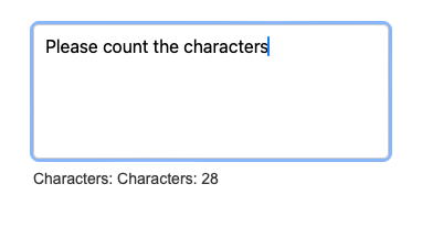
          Example of the Character counter using Javascript, HTML and CSS

          Step-by-Step Explanation

          HTML Structure

          The HTML part is quite simple. It includes a textarea for text input and a div to display the character count. The textarea has an id of textInput, which we will use to reference it in our JavaScript code. The character counter is displayed inside a div with the class counter, and the actual count is inside a span with the id charCount.

          <div class="counter-container">
              <textarea id="textInput" maxlength="150" placeholder="Type something..."></textarea>
              <div class="counter">Characters: <span id="charCount">0</span></div>
          </div>

          CSS Styling

          In the CSS section, we style the body, textarea, and counter. We use Flexbox to organize the elements within the container. The textarea is made non-resizable to maintain the layout, and a warning style is defined to change the counter’s color when a certain threshold is reached.

          /* Basic styling for the body */
          body {
              font-family: Arial, sans-serif;
              margin: 50px;
          }
          
          /* Container for the textarea and counter */
          .counter-container {
              display: flex;
              flex-direction: column;
              max-width: 300px;
          }
          
          /* Styling for the textarea */
          textarea {
              resize: none; /* Prevents resizing */
              width: 100%;
              height: 100px;
              margin-bottom: 10px;
              padding: 10px; /* Add padding for better appearance */
              border: 1px solid #ccc; /* Light gray border */
              border-radius: 5px; /* Rounded corners */
              font-size: 16px; /* Slightly larger font size */
          }
          
          /* Default styling for the character counter */
          .counter {
              font-size: 14px;
              color: #333;
          }
          
          /* Warning style for the counter when nearing the character limit */
          .warning {
              color: red;
          }

          JavaScript Functionality

          The JavaScript part adds an event listener to the textarea. Whenever the user types, the script updates the character count. The character count can be customized to show either the number of characters typed or the number of characters remaining. Additionally, a warning style is applied when the character count exceeds a predefined threshold, and custom messages are displayed when the limit is reached.

          // Get references to the textarea and counter elements
          const textInput = document.getElementById('textInput');
          const charCount = document.getElementById('charCount');
          
          // Maximum length for the input
          const maxLength = 150;
          // Threshold to trigger the warning style
          const warningThreshold = 100;
          // Flag to show remaining characters instead of the count
          const showRemaining = true;
          
          // Add event listener to update the character count on input
          textInput.addEventListener('input', () => {
              // Get the current length of the text input
              const length = textInput.value.length;
          
              // Update the character count or remaining characters
              if (showRemaining) {
                  charCount.textContent = maxLength - length;
              } else {
                  charCount.textContent = length;
              }
          
              // Apply warning style if the threshold is reached
              if (length > warningThreshold) {
                  charCount.classList.add('warning');
              } else {
                  charCount.classList.remove('warning');
              }
          
              // Display custom message when the limit is reached
              if (length >= maxLength) {
                  charCount.textContent = "You have reached the limit!";
              } else if (length > warningThreshold) {
                  charCount.textContent = `Warning: Only ${maxLength - length} characters left`;
              } else {
                  charCount.textContent = `Characters: ${length}`;
              }
          });

          Practical Usage

          This character counter can be practically used in various applications, such as:

          • Social Media Posts: To restrict the length of posts.
          • Text Editors: To provide feedback on document length.
          • Forms: To limit the input in text fields or areas.

          Customizable Options

          To make the character counter more flexible and adaptable to different use cases, we can add several customizable options. Here are five options with detailed descriptions:

          NameDescription
          maxLengthSets the maximum number of characters allowed in the textarea. This can be specified using the maxlength attribute in HTML or dynamically through JavaScript. If the limit is reached, further typing is prevented.
          counterColorAllows customization of the text color of the character counter. This can be set via CSS by changing the color property of the .counter class. It can also be dynamically changed using JavaScript based on the character count.
          warningThresholdSpecifies a threshold for the character count that triggers a warning. When the character count exceeds this threshold, the counter’s appearance can change (e.g., color turns red) to alert the user. This can be implemented using JavaScript to add or remove a CSS class.
          showRemainingDetermines whether the counter displays the number of characters typed or the number of remaining characters. This can be toggled by a boolean variable in JavaScript, updating the display accordingly.
          customMessagesAllows setting custom messages for different character count states (e.g., “You have reached the limit”). These messages can be displayed dynamically using JavaScript based on the current character count.

          Implementing Customizable Options

          1. maxLength

          To set a maximum length for the input, you can use the maxlength attribute directly in the HTML:

          <textarea id="textInput" maxlength="150" placeholder="Type something..."></textarea>

          Alternatively, you can dynamically set this attribute in JavaScript if needed:

          textInput.setAttribute('maxlength', 150);

          2. counterColor

          To customize the counter’s color, update the CSS:

          .counter {
              font-size: 14px;
              color: #333; /* Default color */
          }
          .counter.warning {
              color: red; /* Warning color */
          }

          You can also dynamically change the color using JavaScript based on the character count:

          textInput.addEventListener('input', () => {
              const length = textInput.value.length;
          
              if (length > warningThreshold) {
                  charCount.style.color = 'red'; // Warning color
              } else {
                  charCount.style.color = '#333'; // Default color
              }
          });

          3. warningThreshold

          Add a warning threshold in JavaScript to change the counter’s appearance:

          const warningThreshold = 100;
          
          textInput.addEventListener('input', () => {
              const length = textInput.value.length;
              charCount.textContent = length;
              if (length > warningThreshold) {
                  charCount.classList.add('warning');
              } else {
                  charCount.classList.remove('warning');
              }
          });

          4. showRemaining

          Toggle between showing characters typed and remaining characters:

          const maxLength = 150;
          const showRemaining = true;
          
          textInput.addEventListener('input', () => {
              const length = textInput.value.length;
              if (showRemaining) {
                  charCount.textContent = maxLength - length;
              } else {
                  charCount.textContent = length;
              }
          });

          5. customMessages

          Display custom messages based on character count:

          const maxLength = 150;
          const warningThreshold = 100;
          
          textInput.addEventListener('input', () => {
              const length = textInput.value.length;
              if (length >= maxLength) {
                  charCount.textContent = "You have reached the limit!";
              } else if (length > warningThreshold) {
                  charCount.textContent = `Warning: Only ${maxLength - length} characters left`;
              } else {
                  charCount.textContent = `Characters: ${length}`;
              }
          });

          Adding More Customizable Options

          6. Dynamic Placeholder Text

          To make the placeholder text dynamic based on user interaction, you can update it using JavaScript. For instance, change the placeholder text based on the focus and blur events:

          textInput.addEventListener('focus', () => {
              textInput.placeholder = "Start typing...";
          });
          
          textInput.addEventListener('blur', () => {
              textInput.placeholder = "Type something...";
          });

          7. Character Limit Alert

          You can add an alert box to notify users when they reach the maximum character limit. This enhances user experience by providing immediate feedback.

          textInput.addEventListener('input', () => {
              const length = textInput.value.length;
          
              if (length >= maxLength) {
                  alert("You have reached the maximum character limit!");
              }
          });

          8. Counter Position

          You might want to change the position of the counter based on your layout. For example, place the counter above the textarea:

          <div class="counter-container">
              <div class="counter">Characters: <span id="charCount">0</span></div>
              <textarea id="textInput" maxlength="150" placeholder="Type something..."></textarea>
          </div>

          Questions and Answers

          Q: How can I modify the counter to display remaining characters?

          A: You can modify the script to subtract the current character count from a predefined limit, as shown in the showRemaining option implementation.

          Q: Can I style the counter differently for different character counts?

          A: Yes, you can use JavaScript to add classes based on the count and style those classes in CSS, as demonstrated in the warningThreshold option.

          Q: How can I make the counter work for multiple text areas?

          A: Add unique IDs to each textarea and counter, and use JavaScript to handle each pair separately. You can loop through each textarea and attach event listeners dynamically.

          Q: Is it possible to limit the input to a certain number of characters?

          A: Yes, you can use the maxlength attribute in HTML or implement a check in the JavaScript event listener to prevent further input once the limit is reached.

          Q: How can I count words instead of characters?

          A: Modify the JavaScript to split the input text by spaces and count the resulting array elements. For example:

          textInput.addEventListener('input', () => {
              const wordCount = textInput.value.split(/\s+/).filter(word => word.length > 0).length;
              charCount.textContent = `Words: ${wordCount}`;
          });

          Related Subjects

          1. Form Validation with JavaScript

          Form validation ensures that user inputs are accurate and complete before submission. For more information, check this tutorial on form validation.

          2. JavaScript Event Handling

          Understanding event handling in JavaScript is crucial for interactive web development. Explore more about event handling here.

          3. CSS Flexbox

          Flexbox is a powerful layout tool in CSS. Learn more about Flexbox here.

          4. HTML5 Input Attributes

          HTML5 provides several useful attributes for form inputs. Discover more here.

          Conclusion

          Creating a character counter using JavaScript, HTML, and CSS is straightforward and highly useful for enhancing user experience in text inputs. By following the steps outlined in this blog, you can easily implement this feature in your projects. The customizable options allow you to adapt the counter to different requirements, making it a versatile tool. Additionally, you can expand its functionality with more advanced features, such as dynamic placeholder text, character limit alerts, and flexible counter positioning. Feel free to try the code yourself and customize it according to your needs. If you have any questions, please leave a comment!

          Creating a Customizable Image Lightbox with JavaScript, HTML, and CSS

          Introduction

          Creating an image lightbox enhances the user experience by allowing users to view images in a larger, more focused display. In this guide, we will build a customizable image lightbox using JavaScript, HTML, and CSS. We will include various customization options, such as transition effects, navigation controls, and caption styling, ensuring that you can tailor the lightbox to fit your website’s design perfectly.

          Setting Up the Project

          To begin, create an HTML file to structure your content. You will also need a CSS file for styling and a JavaScript file for functionality.

          HTML Structure

          Start with your HTML file (index.html). This file sets up the basic structure and includes references to your CSS and JavaScript files.

          <!DOCTYPE html>
          <html lang="en">
          <head>
              <meta charset="UTF-8">
              <meta name="viewport" content="width=device-width, initial-scale=1.0">
              <title>Image Lightbox</title>
              <link rel="stylesheet" href="styles.css">
          </head>
          <body>
              <div class="gallery">
                  <img src="image1.jpg" alt="Image 1" class="lightbox-trigger" data-caption="Caption for Image 1">
                  <img src="image2.jpg" alt="Image 2" class="lightbox-trigger" data-caption="Caption for Image 2">
                  <img src="image3.jpg" alt="Image 3" class="lightbox-trigger" data-caption="Caption for Image 3">
              </div>
          
              <div id="lightbox" class="lightbox">
                  <span class="close">&times;</span>
                  <span class="prev">&#10094;</span>
                  <span class="next">&#10095;</span>
                  <img class="lightbox-content" id="lightbox-img">
                  <div class="caption" id="caption"></div>
              </div>
          
              <script src="script.js"></script>
          </body>
          </html>

          CSS Styling

          Next, style your lightbox and gallery in the styles.css file. This CSS will ensure your lightbox looks good and functions well.

          /* Basic body styling */
          body {
              font-family: Arial, sans-serif;
          }
          
          /* Style for the image gallery */
          .gallery {
              display: flex;
              gap: 10px;
          }
          
          /* Style for gallery images */
          .gallery img {
              width: 30%;
              cursor: pointer;
              transition: transform 0.2s;
          }
          
          /* Hover effect for gallery images */
          .gallery img:hover {
              transform: scale(1.1);
          }
          
          /* Lightbox styling */
          .lightbox {
              display: none; /* Hide lightbox by default */
              position: fixed;
              z-index: 999;
              left: 0;
              top: 0;
              width: 100%;
              height: 100%;
              background-color: rgba(0, 0, 0, 0.8);
              justify-content: center;
              align-items: center;
              transition: opacity 0.5s ease; /* Transition effect for lightbox */
          }
          
          /* Lightbox image styling */
          .lightbox-content {
              max-width: 80%;
              max-height: 80%;
              animation: zoomIn 0.5s; /* Zoom-in animation for images */
          }
          
          /* Close button styling */
          .close {
              position: absolute;
              top: 20px;
              right: 35px;
              color: white;
              font-size: 40px;
              font-weight: bold;
              cursor: pointer;
          }
          
          /* Navigation buttons styling */
          .prev, .next {
              position: absolute;
              top: 50%;
              color: white;
              font-size: 30px;
              cursor: pointer;
              user-select: none;
          }
          
          .prev {
              left: 10px;
          }
          
          .next {
              right: 10px;
          }
          
          /* Caption styling */
          .caption {
              color: white;
              text-align: center;
              padding: 10px 0;
              font-size: 20px;
              background-color: rgba(0, 0, 0, 0.5); /* Semi-transparent background for caption */
              animation: fadeIn 0.5s; /* Fade-in animation for caption */
          }
          
          /* Keyframes for zoom-in animation */
          @keyframes zoomIn {
              from {
                  transform: scale(0.5);
              }
              to {
                  transform: scale(1);
              }
          }
          
          /* Keyframes for fade-in animation */
          @keyframes fadeIn {
              from {
                  opacity: 0;
              }
              to {
                  opacity: 1;
              }
          }
          
          /* Thumbnails container */
          .thumbnails {
              display: flex;
              justify-content: center;
              margin-top: 10px;
          }
          
          /* Thumbnail images styling */
          .thumbnail {
              width: 50px;
              cursor: pointer;
              margin: 0 5px;
              transition: transform 0.2s;
          }
          
          /* Hover effect for thumbnails */
          .thumbnail:hover {
              transform: scale(1.2);
          }

          JavaScript Functionality

          Finally, add functionality to your lightbox in the script.js file. This script will handle opening, closing, and navigating the lightbox.

          document.addEventListener('DOMContentLoaded', () => {
              // Get the lightbox elements
              const lightbox = document.getElementById('lightbox');
              const lightboxImg = document.getElementById('lightbox-img');
              const caption = document.getElementById('caption');
              const triggers = document.querySelectorAll('.lightbox-trigger');
              let currentIndex = 0;
          
              // Function to show the lightbox
              const showLightbox = (index) => {
                  lightbox.style.display = 'flex';
                  lightboxImg.src = triggers[index].src;
                  caption.textContent = triggers[index].dataset.caption || triggers[index].alt;
                  currentIndex = index;
              };
          
              // Add click event listeners to triggers
              triggers.forEach((trigger, index) => {
                  trigger.addEventListener('click', () => {
                      showLightbox(index);
                  });
              });
          
              // Close button event listener
              document.querySelector('.close').addEventListener('click', () => {
                  lightbox.style.display = 'none';
              });
          
              // Close lightbox when clicking outside the image
              lightbox.addEventListener('click', (e) => {
                  if (e.target === lightbox) {
                      lightbox.style.display = 'none';
                  }
              });
          
              // Previous button event listener
              document.querySelector('.prev').addEventListener('click', () => {
                  currentIndex = (currentIndex > 0) ? currentIndex - 1 : triggers.length - 1;
                  showLightbox(currentIndex);
              });
          
              // Next button event listener
              document.querySelector('.next').addEventListener('click', () => {
                  currentIndex = (currentIndex < triggers.length - 1) ? currentIndex + 1 : 0;
                  showLightbox(currentIndex);
              });
          
              // Keyboard navigation event listener
              document.addEventListener('keydown', (event) => {
                  if (lightbox.style.display === 'flex') {
                      if (event.key === 'ArrowRight') {
                          currentIndex = (currentIndex < triggers.length - 1) ? currentIndex + 1 : 0;
                          showLightbox(currentIndex);
                      } else if (event.key === 'ArrowLeft') {
                          currentIndex = (currentIndex > 0) ? currentIndex - 1 : triggers.length - 1;
                          showLightbox(currentIndex);
                      } else if (event.key === 'Escape') {
                          lightbox.style.display = 'none';
                      }
                  }
              });
          
              // Thumbnail navigation event listener
              const thumbnails = document.querySelectorAll('.thumbnail');
              thumbnails.forEach(thumbnail => {
                  thumbnail.addEventListener('click', (event) => {
                      const index = parseInt(event.target.dataset.index, 10);
                      showLightbox(index);
                  });
              });
          });

          Customization Options

          To make your lightbox more versatile, we will explore several customization options. These options include changing transition effects, adding keyboard navigation, customizing the lightbox background, and more.

          Transition Effects

          You can customize the transition effect when the lightbox appears and disappears. This can be done by modifying the CSS transition properties.

          CSS

          .lightbox {
              transition: opacity 0.5s ease-in-out; /* Transition effect for lightbox opacity */
          }
          
          .lightbox-content {
              animation: zoomIn 0.5s; /* Zoom-in animation for images */
          }
          
          @keyframes zoomIn {
              from {
                  transform: scale(0.5);
              }
              to {
                  transform: scale(1);
              }
          }

          Keyboard Navigation

          Enhancing user experience with keyboard navigation allows users to navigate through images using arrow keys and close the lightbox with the Esc key.

          JavaScript

          // Event listener for keyboard navigation
          document.addEventListener('keydown', (event) => {
              if (lightbox.style.display === 'flex') {
                  if (event.key === 'ArrowRight') {
                      currentIndex = (currentIndex < triggers.length - 1) ? currentIndex + 1 : 0;
                      showLightbox(currentIndex);
                  } else if (event.key === 'ArrowLeft') {
                      currentIndex = (currentIndex > 0) ? currentIndex - 1 : triggers.length - 1;
                      showLightbox(currentIndex);
                  } else if (event.key === 'Escape') {
                      lightbox.style.display = 'none';
                  }
              }
          });

          Custom

          izing Lightbox Background

          You can adjust the lightbox background to match your site’s theme. Change the color, add gradients, or even use background images.

          CSS

          .lightbox {
              background-color: rgba(0, 0, 0, 0.9); /* Darker background */
              /* Example of gradient background */
              background: linear-gradient(45deg, rgba(0,0,0,0.8), rgba(50,50,50,0.8));
          }

          Adding Thumbnails Navigation

          Adding thumbnail navigation allows users to quickly jump to a specific image.

          HTML

          <div class="thumbnails">
              <img src="image1.jpg" alt="Image 1" class="thumbnail" data-index="0">
              <img src="image2.jpg" alt="Image 2" class="thumbnail" data-index="1">
              <img src="image3.jpg" alt="Image 3" class="thumbnail" data-index="2">
          </div>

          CSS

          .thumbnails {
              display: flex;
              justify-content: center;
              margin-top: 10px;
          }
          
          .thumbnail {
              width: 50px;
              cursor: pointer;
              margin: 0 5px;
              transition: transform 0.2s;
          }
          
          .thumbnail:hover {
              transform: scale(1.2);
          }

          JavaScript

          const thumbnails = document.querySelectorAll('.thumbnail');
          thumbnails.forEach(thumbnail => {
              thumbnail.addEventListener('click', (event) => {
                  const index = parseInt(event.target.dataset.index, 10);
                  showLightbox(index);
              });
          });

          Caption Styling

          To make your captions more visually appealing, you can apply various CSS styles, such as background color, font styles, and animations.

          CSS

          .caption {
              color: white;
              text-align: center;
              padding: 10px 0;
              font-size: 20px;
              background-color: rgba(0, 0, 0, 0.5); /* Semi-transparent background for caption */
              animation: fadeIn 0.5s; /* Fade-in animation for caption */
          }
          
          @keyframes fadeIn {
              from {
                  opacity: 0;
              }
              to {
                  opacity: 1;
              }
          }

          Practical Usage

          This lightbox implementation is versatile and can be used in various scenarios. Here are a few practical applications:

          1. E-commerce Websites: Display product images in a large, detailed view.
          2. Photography Portfolios: Showcase high-quality images in a professional manner.
          3. Blogs: Enhance blog posts with an interactive gallery.
          4. Art Galleries: Present artwork with detailed captions and high-resolution images.

          Questions and Answers

          Q: How can I add more images to the lightbox?
          A: Simply add more <img> elements within the gallery <div> in your HTML file, ensuring they have the class lightbox-trigger.

          Q: Can I use this lightbox for videos?
          A: Yes, you can modify the code to include video elements. Replace the image elements and source updates with video tags and sources.

          Q: How do I close the lightbox by clicking outside the image?
          A: The current JavaScript setup already includes this functionality. Clicking outside the image (but inside the lightbox) will close it.

          Q: How can I style the captions differently?
          A: Modify the CSS class .caption to change the styling of the captions, such as font size, color, and text alignment.

          Q: Is it possible to add animations to the image transitions?
          A: Yes, you can use CSS animations or transitions to add effects when changing images, such as fade-in or slide-in effects.

          Related Subjects

          1. CSS Grid Layout for Galleries: Learn how to use CSS Grid Layout to create responsive and flexible gallery layouts. CSS Tricks
          2. JavaScript Event Handling: Explore JavaScript event handling to better understand how events like clicks can be managed effectively. MDN Web Docs
          3. Responsive Web Design: Discover techniques for making your lightbox and other web components responsive. Smashing Magazine
          4. Advanced CSS Animations: Dive into advanced CSS animations to create engaging visual effects for your lightbox. CSS Tricks

          Conclusion

          Building a customizable image lightbox with JavaScript, HTML, and CSS is a rewarding project that enhances the user experience on your website. By following this guide, you can create a functional and aesthetically pleasing lightbox, complete with various customization options. Experiment with different styles and features to make the lightbox uniquely yours. If you have any questions or need further assistance, feel free to ask in the comments.

          Create a Countdown Timer Using JavaScript, HTML, and CSS

          Introduction

          Countdown timers are essential in various applications, such as event countdowns, sales promotions, and task deadlines. This guide will show you how to create a simple and effective countdown timer using JavaScript, HTML, and CSS. We’ll cover the entire process, from setting up the HTML structure to styling with CSS and adding functionality with JavaScript. Additionally, we’ll discuss several customization options to tailor the timer to your specific needs, including responsive design, different themes, and additional functionalities like alerts and notifications.

          Building the Countdown Timer

          Step 1: Setting Up HTML

          First, we’ll create the basic structure of our countdown timer using HTML. The HTML will include a container for the timer display.

          <!DOCTYPE html>
          <html lang="en">
          <head>
              <meta charset="UTF-8">
              <meta name="viewport" content="width=device-width, initial-scale=1.0">
              <title>Countdown Timer</title>
              <link rel="stylesheet" href="styles.css">
          </head>
          <body>
              <div id="timer">
                  <div id="days" class="time-section">
                      <span class="number">00</span>
                      <span class="label">Days</span>
                  </div>
                  <div id="hours" class="time-section">
                      <span class="number">00</span>
                      <span class="label">Hours</span>
                  </div>
                  <div id="minutes" class="time-section">
                      <span class="number">00</span>
                      <span class="label">Minutes</span>
                  </div>
                  <div id="seconds" class="time-section">
                      <span class="number">00</span>
                      <span class="label">Seconds</span>
                  </div>
              </div>
              <script src="script.js"></script>
          </body>
          </html>

          Step 2: Styling with CSS

          Next, we’ll style the countdown timer to make it visually appealing. We’ll use CSS for this purpose.

          /* styles.css */
          
          body {
              font-family: Arial, sans-serif;
              display: flex;
              justify-content: center;
              align-items: center;
              height: 100vh;
              margin: 0;
              background-color: #f0f0f0;
          }
          
          #timer {
              display: flex;
              justify-content: center;
              align-items: center;
              background: #333;
              color: white;
              padding: 20px;
              border-radius: 10px;
              box-shadow: 0 4px 8px rgba(0, 0, 0, 0.1);
          }
          
          .time-section {
              text-align: center;
              margin: 0 10px;
          }
          
          .number {
              font-size: 2em;
              display: block;
          }
          
          .label {
              font-size: 1em;
              color: #bbb;
          }

          Step 3: Adding Functionality with JavaScript

          Now, we’ll add the JavaScript code to make the countdown timer functional. This script will calculate the time remaining until a specified date and update the timer display accordingly.

          // script.js
          
          // Set the date we're counting down to
          const countdownDate = new Date("Dec 31, 2024 23:59:59").getTime();
          
          // Update the count down every 1 second
          const x = setInterval(function() {
          
              // Get today's date and time
              const now = new Date().getTime();
          
              // Find the distance between now and the countdown date
              const distance = countdownDate - now;
          
              // Time calculations for days, hours, minutes, and seconds
              const days = Math.floor(distance / (1000 * 60 * 60 * 24));
              const hours = Math.floor((distance % (1000 * 60 * 60 * 24)) / (1000 * 60 * 60));
              const minutes = Math.floor((distance % (1000 * 60 * 60)) / (1000 * 60));
              const seconds = Math.floor((distance % (1000 * 60)) / 1000);
          
              // Display the result in the corresponding elements
              document.getElementById("days").querySelector('.number').innerText = days;
              document.getElementById("hours").querySelector('.number').innerText = hours;
              document.getElementById("minutes").querySelector('.number').innerText = minutes;
              document.getElementById("seconds").querySelector('.number').innerText = seconds;
          
              // If the countdown is finished, write some text 
              if (distance < 0) {
                  clearInterval(x);
                  document.getElementById("timer").innerHTML = "EXPIRED";
              }
          }, 1000);

          Example Countdown Timer using Javascript, HTML and CSS.

          Customization Options

          To make your countdown timer unique and suited to your needs, you can customize it in several ways:

          Changing the Countdown Date

          Description

          To change the countdown date, you only need to modify the countdownDate variable in the JavaScript code. This is helpful if you want the timer to count down to a different event or deadline.

          Implementation

          In the script.js file, locate the line where the countdownDate is set and change it to your desired date and time.

          const countdownDate = new Date("Jan 1, 2025 00:00:00").getTime();

          Styling the Timer

          Description

          Customizing the timer’s appearance can make it more visually appealing and aligned with your website’s design. You can modify various CSS properties, such as background color, font size, and spacing.

          Implementation

          Open the styles.css file and change the CSS rules. For example, to change the background color and font size:

          #timer {
              background: #444;
              font-size: 1.5em;
          }

          Adding an Alert Message

          Description

          An alert message can notify users when the countdown reaches zero. This is useful for drawing attention to the end of the countdown period.

          Implementation

          Modify the JavaScript to include an alert when the countdown ends.

          if (distance < 0) {
              clearInterval(x);
              document.getElementById("timer").innerHTML = "EXPIRED";
              alert("The countdown has ended!");
          }

          Adding Sound Notification

          Description

          A sound notification can be an effective way to alert users when the countdown ends, especially if they are not actively looking at the screen.

          Implementation

          1. Add an audio element to your HTML:
          <audio id="endSound" src="alert.mp3" preload="auto"></audio>
          1. Modify the JavaScript to play the sound when the countdown ends:
          if (distance < 0) {
              clearInterval(x);
              document.getElementById("timer").innerHTML = "EXPIRED";
              document.getElementById("endSound").play();
          }

          Responsive Design

          Description

          Making your countdown timer responsive ensures that it looks good on all devices, including smartphones, tablets, and desktops. This is achieved using CSS media queries.

          Implementation

          Add CSS media queries to adjust the timer’s layout for smaller screens.

          @media (max-width: 600px) {
              #timer {
                  flex-direction: column;
                  padding: 10px;
              }
              .time-section {
                  margin: 5px 0;
              }
          }

          Custom Fonts and Colors

          Description

          Using custom fonts and colors can enhance the visual appeal of your timer. You can integrate fonts from services like Google Fonts and use CSS to apply them.

          Implementation

          1. Include a Google Font in your HTML:
          <link href="https://fonts.googleapis.com/css2?family=Roboto:wght@300;400;700&display=swap" rel="stylesheet">
          1. Update your CSS to use the new font and colors:
          body {
              font-family: 'Roboto', sans-serif;
          }
          
          #timer {
              background: linear-gradient(90deg, #4b6cb7, #182848);
              color: #fff;
          }
          
          .number {
              color: #ff6f61;
          }
          
          .label {
              color: #ff9f43;
          }

          Displaying Additional Information

          Description

          Adding elements such as messages or buttons can provide more context or interactivity to your countdown timer. For example, you can display a message about the event or provide a button to restart the countdown.

          Implementation

          1. Add additional elements to your HTML:
          <div id="message">Countdown to the New Year!</div>
          <button id="restartButton">Restart</button>
          1. Update your JavaScript to handle the button click and restart the countdown:
          document.getElementById("restartButton").addEventListener("click", function() {
              const newCountdownDate = new Date("Dec 31, 2025 23:59:59").getTime();
              countdownDate = newCountdownDate;
              startCountdown();
          });
          
          function startCountdown() {
              const x = setInterval(function() {
                  // existing code to calculate and display the countdown
              }, 1000);
          }
          
          startCountdown();

          Adding Time Zone Support

          Description

          If your countdown timer needs to be accurate across different time zones, you can adjust it using JavaScript to consider the local time zone of the event.

          Implementation

          Use the toLocaleString method in JavaScript to adjust the countdown date for a specific time zone.

          const countdownDate = new Date(new Date("Dec 31, 
          
          2024 23:59:59").toLocaleString("en-US", {timeZone: "America/New_York"})).getTime();

          Adding Pause and Resume Functionality

          Description

          Providing the ability to pause and resume the countdown timer adds flexibility for users who might need to halt the countdown temporarily.

          Implementation

          1. Add pause and resume buttons to your HTML:
          <button id="pauseButton">Pause</button>
          <button id="resumeButton">Resume</button>
          1. Update your JavaScript to handle the pause and resume functionality:
          let paused = false;
          document.getElementById("pauseButton").addEventListener("click", function() {
              paused = true;
          });
          
          document.getElementById("resumeButton").addEventListener("click", function() {
              paused = false;
          });
          
          const x = setInterval(function() {
              if (!paused) {
                  // existing code to calculate and display the countdown
              }
          }, 1000);

          Practical Usage of the Countdown Timer

          This countdown timer can be used in various scenarios. For instance, you can embed it on a webpage to count down to a product launch or an event. By changing the countdownDate in the JavaScript code, you can easily set a different target date and time.

          Example

          Let’s say you want to create a countdown timer for New Year’s Eve. You would set the countdownDate to "Dec 31, 2024 23:59:59", as shown in the example above. The timer will then display the remaining time until that date.

          Questions and Answers

          Q: How do I change the countdown date?

          A: Change the value of countdownDate in the JavaScript code to your desired date and time.

          Q: Can I style the timer differently?

          A: Yes, you can customize the CSS in styles.css to change the appearance of the timer.

          Q: What happens when the countdown reaches zero?

          A: The script clears the interval and changes the timer display to “EXPIRED.”

          Q: How can I make the timer responsive?

          A: Use CSS media queries to adjust the timer’s style for different screen sizes.

          Q: Can I use this timer for multiple events?

          A: Yes, you can create multiple instances of the timer by duplicating the HTML structure and modifying the JavaScript accordingly.

          Q: How do I add a sound notification?

          A: Include an audio element in your HTML and use JavaScript to play it when the countdown ends.

          Q: Can I add a message when the countdown ends?

          A: Yes, you can add a custom message in the JavaScript code to be displayed when the countdown ends.

          Q: How do I make the timer display in a different language?

          A: Modify the label elements in the HTML to the desired language.

          Q: Can I use a custom font for the timer?

          A: Yes, you can include custom fonts using services like Google Fonts and update your CSS accordingly.

          Q: How do I restart the countdown without refreshing the page?

          A: Add a button to restart the countdown and handle the logic in JavaScript to set a new countdown date and restart the interval.

          Q: Can I add pause and resume functionality?

          A: Yes, you can add buttons to pause and resume the countdown timer and update the JavaScript accordingly.

          Q: How can I adjust the timer for different time zones?

          A: Use the toLocaleString method in JavaScript to adjust the countdown date for specific time zones.

          1. JavaScript Date Object: Learn more about the Date object and its methods. MDN Web Docs
          2. CSS Flexbox: Understand how to use Flexbox for creating flexible and responsive layouts. CSS-Tricks
          3. JavaScript setInterval() Method: Explore how to use setInterval() for running code at specified intervals. W3Schools
          4. HTML Structure: Learn best practices for structuring HTML documents. W3C
          5. JavaScript Event Listeners: Discover how to use event listeners to handle user interactions. MDN Web Docs
          6. CSS Media Queries: Learn how to use media queries to create responsive designs. MDN Web Docs

          Conclusion

          Creating a countdown timer with JavaScript, HTML, and CSS is straightforward and versatile. You can customize the timer to suit different applications and styles, including changing the countdown date, adding alerts and sound notifications, and making the timer responsive. Try implementing this countdown timer in your projects and feel free to ask any questions in the comments.