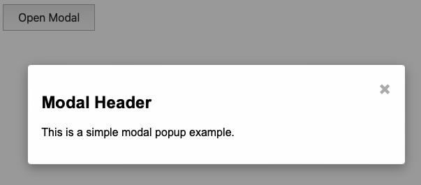
Modal popups are a versatile tool in web development, often used for displaying information, forms, or other content without navigating away from the current page. In this article, we’ll walk through the steps to create a modal popup using JavaScript, HTML, and CSS.
Introduction
A modal popup is a dialog box that appears on top of the current page, requiring interaction before returning to the main content. It enhances user experience by keeping users on the same page while providing additional information or functionality.
In this guide, we will create a simple modal popup from scratch, explaining each part in detail. This is perfect for developers looking to enhance their web pages with dynamic content presentation.
HTML Structure
First, let’s set up the basic HTML structure. This includes the modal itself and a button to trigger it.
<!DOCTYPE html>
<html lang="en">
<head>
<meta charset="UTF-8">
<meta name="viewport" content="width=device-width, initial-scale=1.0">
<title>Modal Popup Example</title>
<link rel="stylesheet" href="styles.css">
</head>
<body>
<button id="openModalBtn">Open Modal</button>
<div id="myModal" class="modal">
<div class="modal-content">
<span class="close-btn">×</span>
<h2>Modal Header</h2>
<p>This is a simple modal popup example.</p>
</div>
</div>
<script src="script.js"></script>
</body>
</html>Explanation
- Button:
<button id="openModalBtn">Open Modal</button>triggers the modal. - Modal Structure:
<div id="myModal" class="modal">is the modal container.<div class="modal-content">contains the content of the modal.<span class="close-btn">×</span>is the close button.
CSS Styling
Next, we’ll style the modal using CSS to make it visually appealing.
/* styles.css */

body {
    font-family: Arial, sans-serif;
}

button {
    padding: 10px 20px;
    font-size: 16px;
    cursor: pointer;
}

.modal {
    display: none;
    position: fixed;
    z-index: 1;
    left: 0;
    top: 0;
    width: 100%;
    height: 100%;
    overflow: auto;
    background-color: rgba(0, 0, 0, 0.4);
}

.modal-content {
    background-color: #fefefe;
    margin: 15% auto;
    padding: 20px;
    border: 1px solid #888;
    width: 80%;
    max-width: 500px;
    border-radius: 5px;
    box-shadow: 0 5px 15px rgba(0,0,0,0.3);
}

.close-btn {
    color: #aaa;
    float: right;
    font-size: 28px;
    font-weight: bold;
}

.close-btn:hover,
.close-btn:focus {
    color: #000;
    text-decoration: none;
    cursor: pointer;
}
Explanation
- Modal Background: The
.modalclass styles the background to cover the entire screen and adds a semi-transparent black background. - Modal Content: The
.modal-contentclass centers the modal on the screen, gives it a white background, and adds padding and rounded corners. - Close Button: The
.close-btnstyles the close button and changes its color when hovered or focused.
JavaScript Functionality
Finally, we’ll add JavaScript to handle the opening and closing of the modal.
// script.js

// Get the modal element
var modal = document.getElementById('myModal');

// Get the button that opens the modal
var btn = document.getElementById('openModalBtn');

// Get the <span> element that closes the modal
var span = document.getElementsByClassName('close-btn')[0];

// When the user clicks the button, open the modal
btn.onclick = function() {
    modal.style.display = 'block';
}

// When the user clicks on <span> (x), close the modal
span.onclick = function() {
    modal.style.display = 'none';
}

// When the user clicks anywhere outside of the modal, close it
window.onclick = function(event) {
    if (event.target == modal) {
        modal.style.display = 'none';
    }
}
Explanation
- Opening the Modal: When the button is clicked, the modal’s display style is set to
block, making it visible. - Closing the Modal: The modal can be closed by clicking the close button or by clicking anywhere outside the modal.

Practical Usage
This modal can be used in various scenarios, such as:
- Form Submissions: Displaying forms without navigating away from the current page.
- Alerts and Notifications: Showing important messages or alerts.
- Image Galleries: Viewing images in a larger format.
By combining HTML, CSS, and JavaScript, we can create a functional and stylish modal popup that enhances user interaction on your website.
Questions and Answers
Q: Can I use this modal for multiple popups on the same page?
A: Yes, you can create multiple modal elements with unique IDs and corresponding JavaScript functions to manage each modal.
Q: How can I make the modal more accessible?
A: Ensure that the modal can be navigated using the keyboard, and provide appropriate ARIA attributes for screen readers.
Q: Can I animate the modal for a smoother appearance?
A: Yes, you can use CSS animations or transitions to animate the modal’s appearance and disappearance.
Q: What if I need to load dynamic content into the modal?
A: You can use JavaScript to dynamically insert content into the modal before displaying it.
Q: How do I prevent the modal from closing when clicking inside it?
A: Ensure that the click event listener only closes the modal when the event target is outside the modal content.
Related Subjects
- Responsive Modals: Learn how to create modals that adapt to different screen sizes for a better user experience on mobile devices. CSS Tricks
- JavaScript Events: Understand how to handle various JavaScript events to create interactive web applications. Mozilla Developer Network
- CSS Animations: Explore CSS animations to enhance the visual appeal of your web elements, including modals. W3Schools
- ARIA for Modals: Implement ARIA roles and properties to improve accessibility for users with disabilities. WebAIM
Conclusion
Creating a modal popup using JavaScript, HTML, and CSS is a straightforward process that can greatly enhance your web applications. By following this guide, you can build a functional and attractive modal that serves various purposes on your site. Try it out, and feel free to ask questions or share your experiences in the comments.